Atlas Dash
Designed a mobile platform for Atlas Dash users to track their subscription fees and appeal to a wider market.
The Challenge
Atlas Dash needed a mobile app to appeal to a greater share of their potential users since more than 50% were on mobile devices.
The Problem
People with recurring expenses (or subscriptions) need a platform to view and manage all of their expenses in one place to make informed budget decisions.
Role
Tools
Client
Year
UX Designer
Figma, Maze
Atlas Dash
2023
Goals
Display subscriptions in one place to give users a comprehensive overview of their spending habits.
Users can cancel subscriptions to reduce excessive spending.
Users can create alerts for automatically-renewing subscriptions to help them track their budget.
Research and Analysis
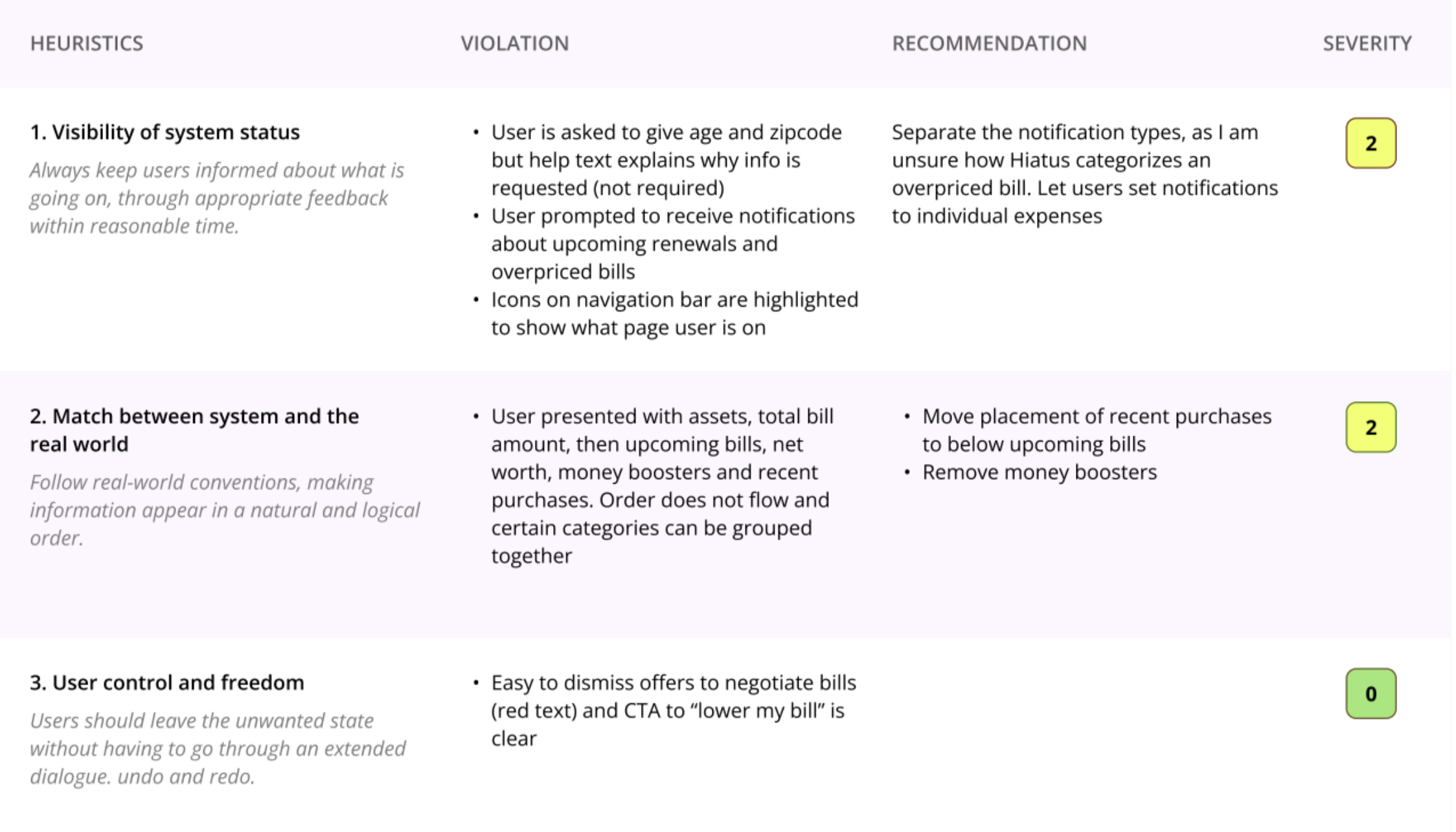
I conducted a heuristic evaluation of three competitor apps to determine pain points and strengths that I could draw inspiration from for my design.
research
Key Insights
1
All three competitors excelled in recognition rather than recall: the user can view all their subscriptions/expenses and related data in one place. They struggled in consistency and standards: used inconsistent terminology and don’t allow users to connect their personal checking/credit card accounts to easily import their expenses.
user
User Flows
Using Figma, I designed user flows to manage and modify subscriptions (seen below) and create a subscription alert.
sketches
Concepts, Sketching, Wireframes
I designed low-fidelity wireframes of key screens, ensuring the navigation of this mobile app was simple and intuitive, the CTAs were effective and placed well, and that I satisfied the business goals.
usability
Usability Testing: Round one
I conducted two rounds of remote usability testing, presenting tasks that included cancelling a subscription, recategorizing a subscription, and creating a recurring payment notification. In this initial round , users had a difficult time locating the filter icon, searching for a specific subscription, and identifying the correct CTA for specific tasks. Before the second round, I improved the icons’ and CTAs’ visibility and recognizability and made sure that the top search bar was available on all pages.
Task
Results
prototype
Recategorize subscription
44.4% misclick rate, 100% success rate
Create payment alert
50% misclick rate, 100% success rate
View annual total cost
0% misclick rate, 100% success rate
Visual Design & Prototype
The colors and typography reflect the brand’s key attributes: trustworthy, caring, friendly and casual. The graphics, like the chart in the statistics page below, are simple and easy to read and the calls-to-action are clearly viewed/easy to find on the pages.
testing
usability testing: round two
iterations
Task: Recategorize your Hulu subscription
Results: 100% misclick rate, 100% success rate
Because of the way the question was worded, users clicked the incorrect subscription
Users may have attempted to filter out the subscription by category (e.g., streaming)
Task: Cancel your Hulu subscription
Results: 100% misclick rate, 71% success rate
Not all users were initially knew where to find the correct CTA
Test: Create a recurring payment alert
Results: 43% misclick rate, 100% success rate
The CTA was not well-placed on the page
The clicks on the subscription and calendar icons on the navigation bar could indicate that these users almost gave up on the task before discovering the correct CTA
Task: View total yearly subscription amount
Results: 100% misclick rate, 14% bounce rate
The correct link was not clearly viewable on the page
Users took two sensible paths I had not accounted for: the statistics page and “view all payments” CTA, which could have given them the desired results.
Design Iterations
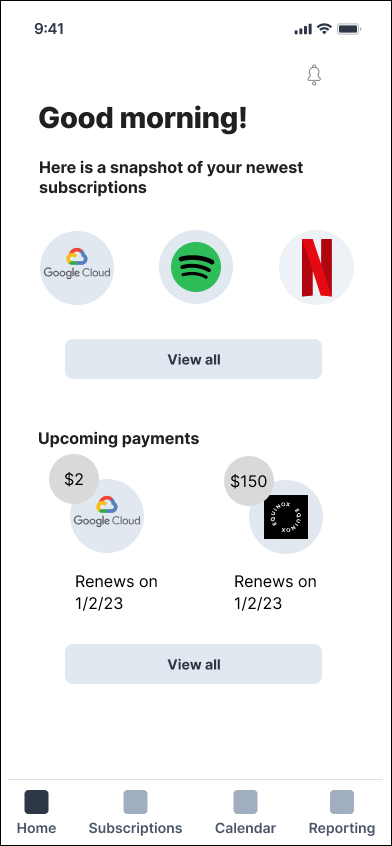
Home Page
Initial Design
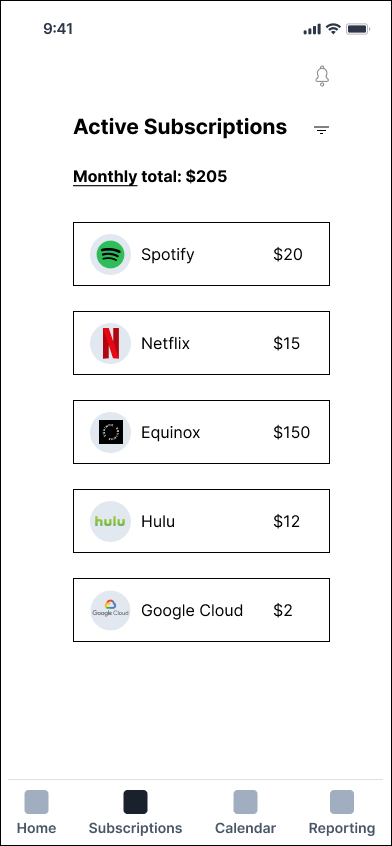
Subscription Modal
Initial Design
Statistics Modal
Initial Design
Remove the link from the monthly total and create a separate yearly total CTA
Update the highlight color in the navigation bar so it’s more easily viewed by users
Move the primary and secondary CTAs to the top of the page to improve visual hierarchy
Redesign the chart to display payments year-to-date and forecasted, which are likely more useful data points for the user
Break out expenses by subscription category and display data points
Update graph colors to distinguish between subscription categories
Final Design
Final Design
Final Design
Challenges and Conclusion
I would have liked to retest my designs for a third time to see if:
The misclick rate for cancelling a subscription decreases
The misclick rate for viewing yearly subscription total decreases
Should the design have move forward in the test and iterate processes, I could determine the overall impact: whether users could make informed budgeting decisons.
Important Lessons Learned
Beware of how test questions are phrased
Not all users may understand industry terminology (like streaming services) in the same way.
Pay attention to visual hierarchy
Moving the CTAs to the top of the subscription modal would likely decrease the misclick rate for their respective tasks.


