Classscape
Project
Mobile (iOS)
Role
UX Designer
Tools
Figma, Miro
Year
2022
Problem
People with fitness routines need a community to stay motivated to achieve their fitness goals.
Objectives and Goals
To improve the experience of finding group fitness classes.
Design an app that keeps users accountable to maintain their fitness routine and offers a supportive community of like-minded individuals.
developed
Test the assumption that people may be unaware of all that a gym or studio has to offer, and that trying new classes can be intimidating or stressful.
RESEARCH
I developed a screener survey for 20 people to find participants for my five user experience interviews.
ideate
Ideate
I outlined my information architecture, creating a sitemap of the important pages I wanted to include in my design and created user flows of booking a class and inviting a friend to a class to visualize site navigation from the user perspective.
prototype
PROTOTYPE
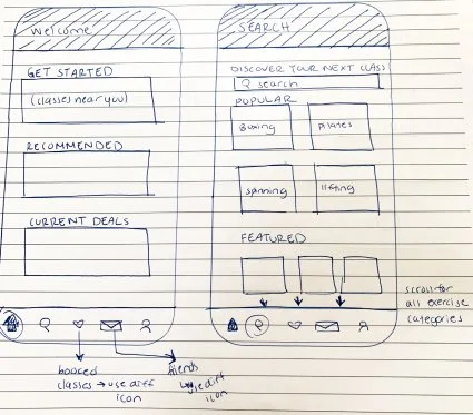
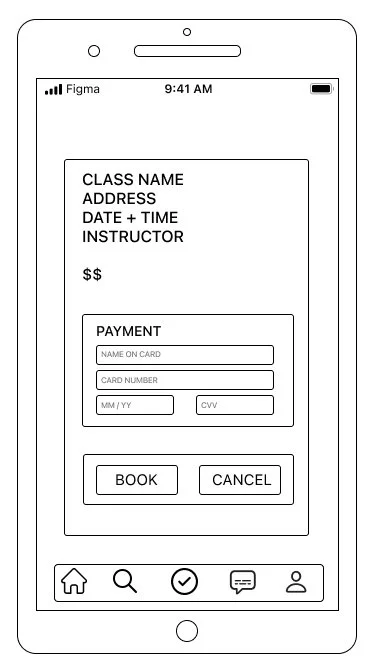
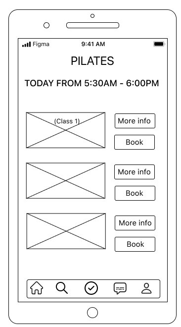
I formulated my initial prototype by creating sketches of my red routes which were used in my guerilla testing. Two key takeaways:
Change the icons in the navigation bar for easier interpretation
Better connect the reviews page to the rest of the app
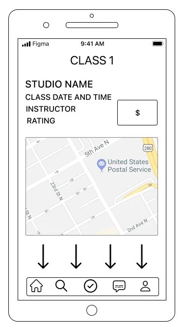
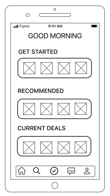
I built my wireframes in Figma using my sketches as a starting point and taking into consideration the feedback I received in my guerrilla usability tests.
Throughout this process, I iterated my designs and took into consideration elements such as page navigation, consistent use of CTAs, and usability elements like button and font size.
testing
Testing
The usability test script I designed would be used for ten unique users over two rounds of testing. Using heat maps, I deduced three major takeaways from the first round of testing:
Update the search icon on the navigation bar to be more user-friendly
Make the Classscape invitation more easily accessible
Make class reviews viewable to all users
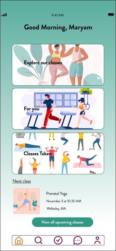
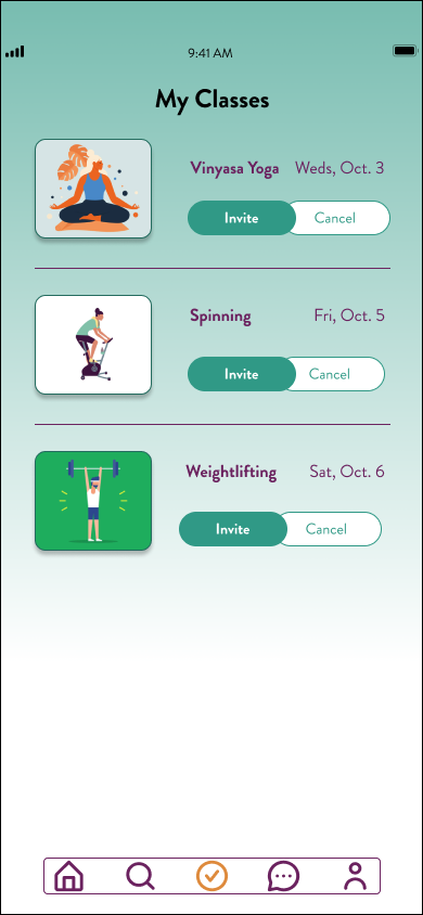
With my updated prototype, I created a new test in Maze for five new participants. Similar to the first round, I used heat maps to analyze site navigation. The biggest takeaway was that the flow for inviting a friend to download the app had one additional (and unnecessary) screen whose presence confused the users.
takeaways
Design iterations and takeaways
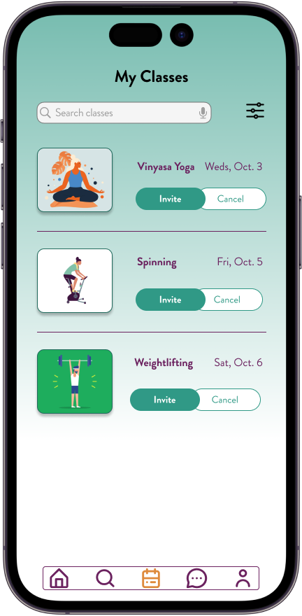
Results and Impact: users had a simpler time navigating and completing tasks using the second iteration of my HiFi prototype.
Lessons Learned: constructive feedback was a valuable resource used to iterate on my work and provide a workable solution.
Next Steps: I would test my assumption that providing a community-based tool can keep users accountable in maintaining their fitness routines.


